Type Design
Arlecchino
A type family that plays with different styles while keeping the same spirit
2011
Coursework for Masters degree in Typeface Design, University of Reading, UK.

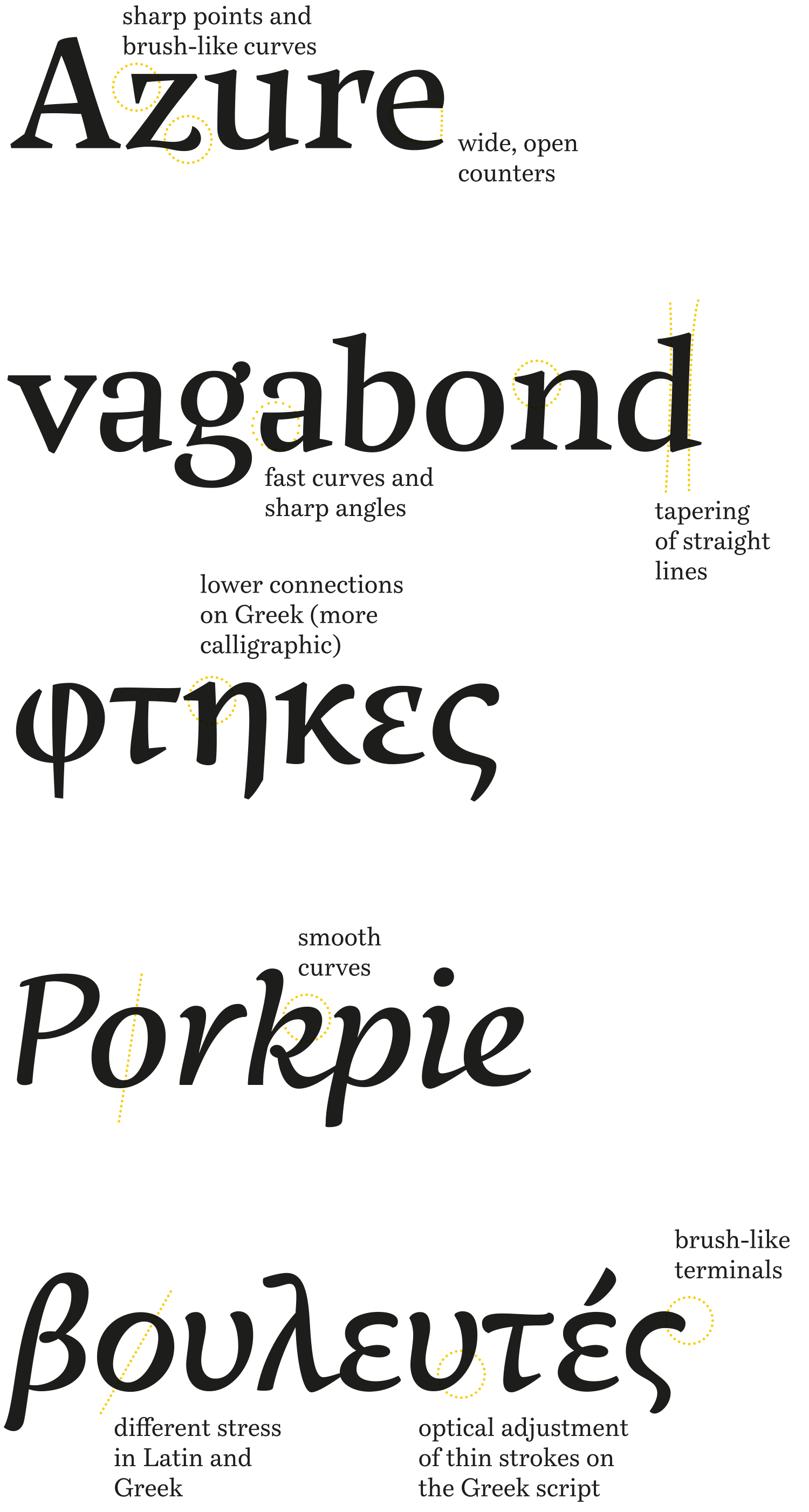
The type family Arlecchino, still a work in progress, explores the possibilities of style differences within weights of a type family while maintaining harmony.
The curves carry the gestural quality of fast sketches and result in a playful typeface with a strong personality, legible and readable in text settings. It has been designed for the Latin and Greek scripts as part of a Masters degree in type design in Reading, UK.
This was my first contact with type design (I had no previous knowledge whatsoever of the subject before going to study in Reading). Many of the design decisions have been made with the intent of learning as much as possible during that year of study, which led to an attempt to combine many different styles within a single type family. While I would probably take many different directions if I were to tackle the same brief today, the project did serve its learning purpose and allowed me to experiment with different styles that share the same flavor.
The challenge was also to adapt the dynamism of fast and loose sketches into the systematic language of text typography.
At present, the project is slowly being developed further for release as soon as it is completed.


