
Typeface design
Bligh
A warm, playful sans-serif typeface that balances flavour and functionality.
2015
Typeface published by Dalton Maag (London, UK).
Designed with the support of the Dalton Maag team.
︎Selected as one of Typographica’s “Best Typefaces of 2015”.
︎Selected for the 11th Brazilian Graphic Design Biennial (Bienal ADG) in 2015.

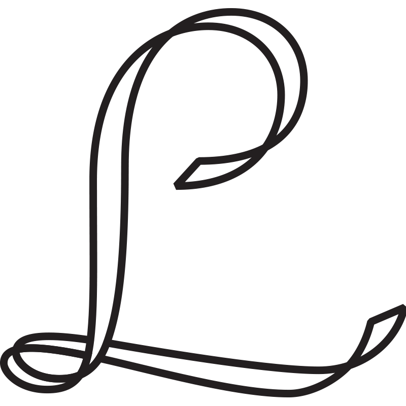
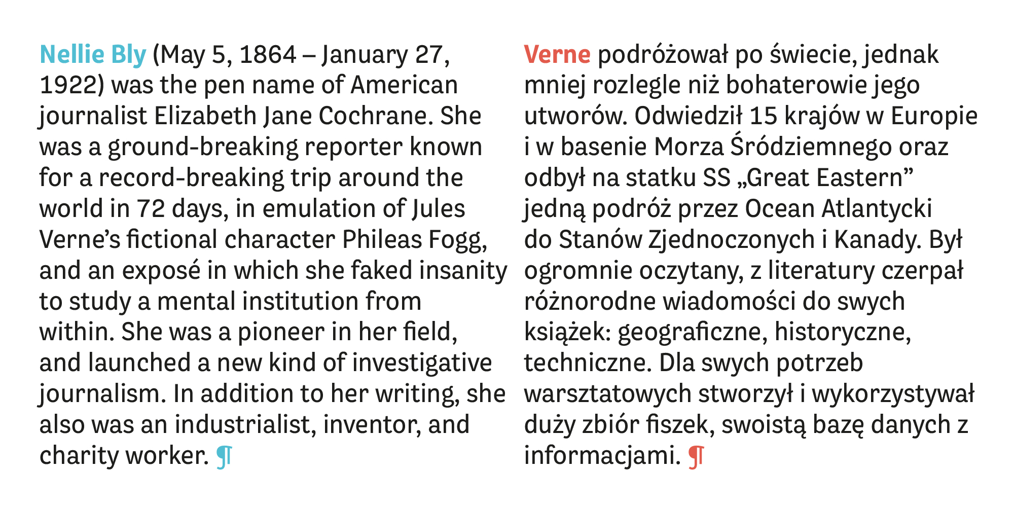
Bligh is a 3-weight sans-serif type family which I designed from scratch while working at Dalton Maag, published in April 2015.
The challenge was to design a low-contrast sans-serif that works well in text settings but has a warm, playful feel and a strong personality. It was an exercise in pushing its quirkiness and personality, and reeling it back to find the balance between flavour and functionality.

The characters often have a quirky skeleton, sometimes with an organic calligraphic influence, and with a slight nod to Victorian grotesque styles. It has very low contrast, and fairly condensed proportions, but is very readable in text sizes without losing its flavour.
The uppercase set has a more sober voice to increase the possibility of hierarchical variation when typesetting, since the family has no italics or small caps.
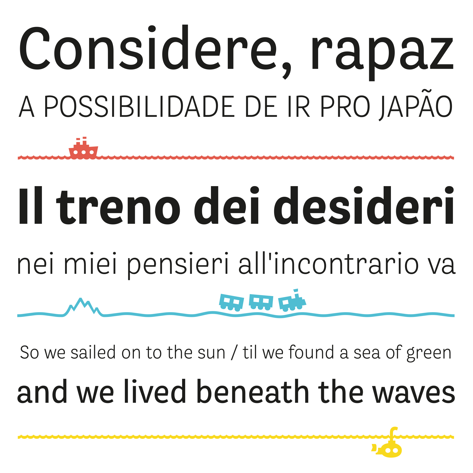
As a reference to the playful Victorian Grotesque influence, I also designed a set of symbols inspired by travel, which can be typeset in a continuous line to form a custom route of travel over hills, mountains and seas.
To purchase the font, please visit Dalton Maag's website (you can also get a free trial license there!).