
logo + branding
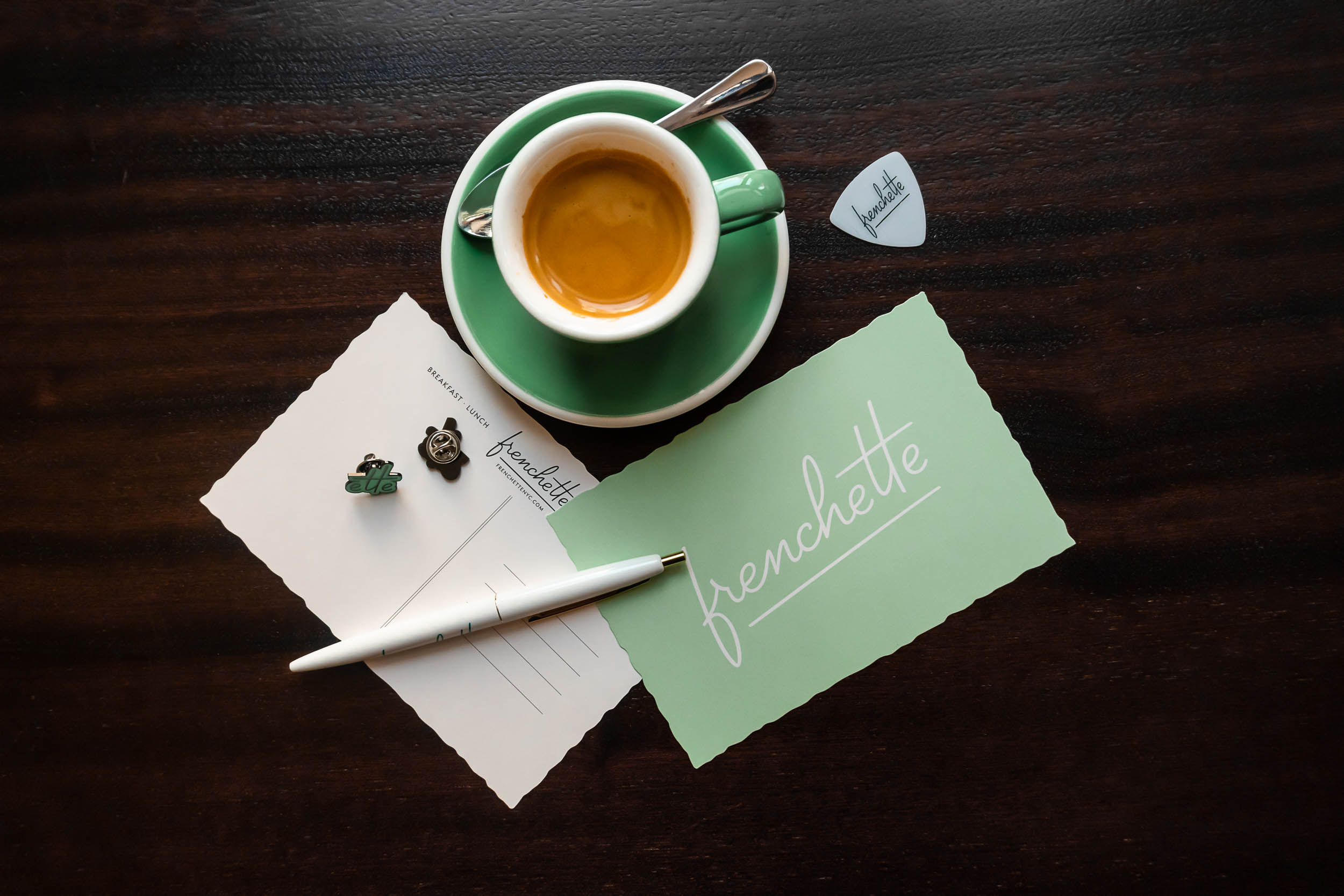
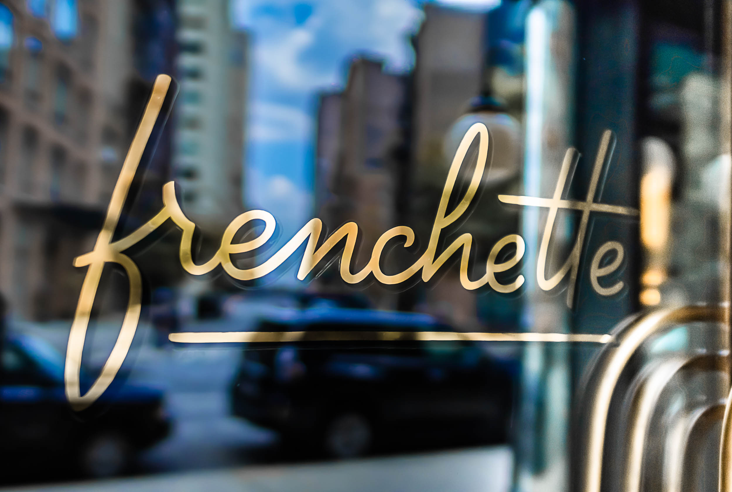
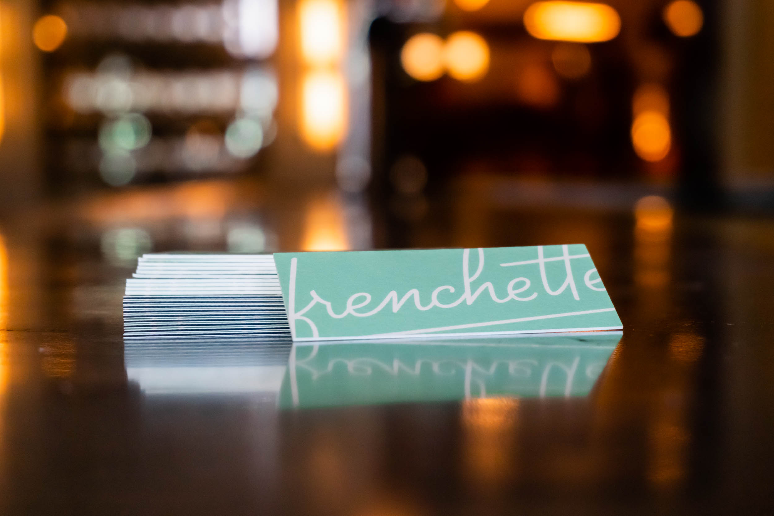
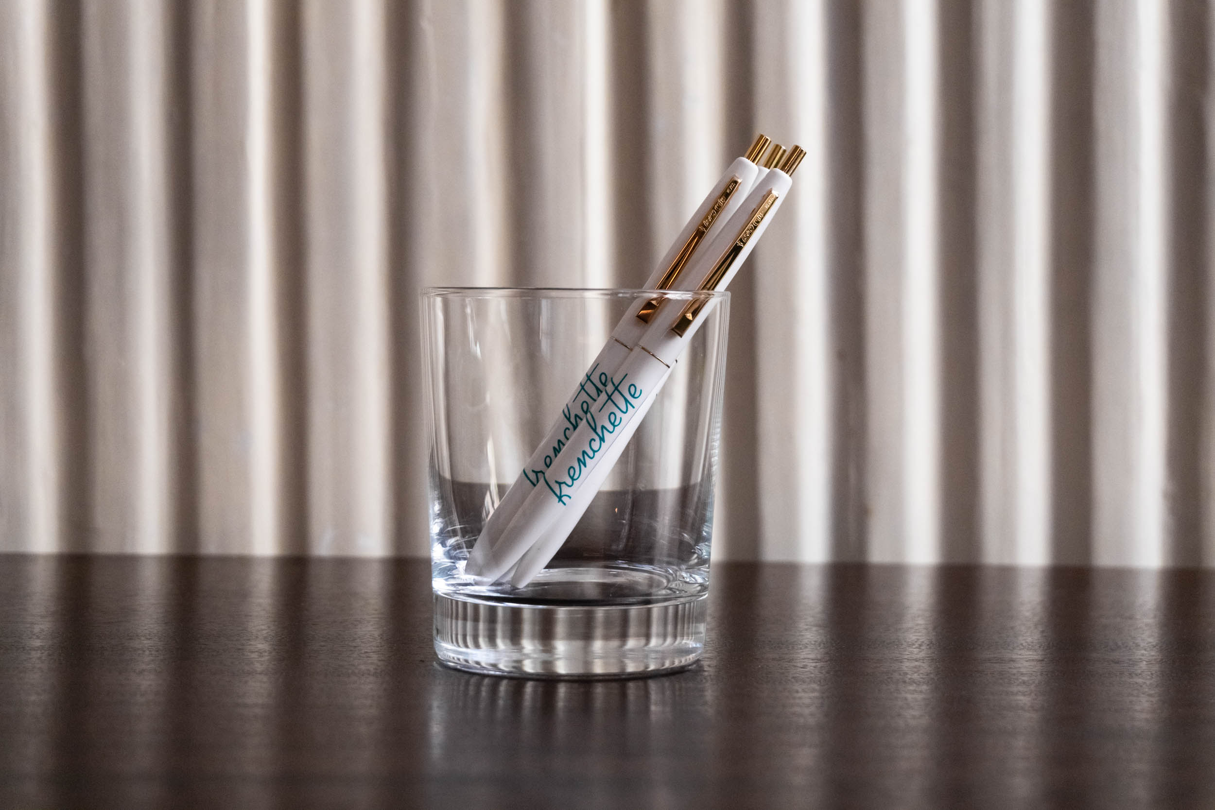
Frenchette
Branding for Frenchette, a French bistro in New York.
2017
Studio: Mucca Design
Creative Director: Matteo Bologna
With designer: Sean O’Connor
While I was living in London, I took any opportunity I could to travel to France and marvel at the cities and towns, the gorgeous typography on storefronts and, of course, the food! Later, when I was at Mucca and the chance to work on the design for a French bistro came along, I jumped at it with all my might.
Frenchette is a new restaurant in Manhattan which, according to the Village Voice, sits at the nexus of being ultra-luxe, ambitious and a safe bet. The chefs and owners, Riad Nasr and Lee Hanson, wanted it to be urban, sophisticated but welcoming, with exciting, spontaneous but perfect food, inspired by Paris’ neo-bistro movement. It’s one of those tricky briefs that have to combine contradicting concepts: traditional and modern, high-end but unpretentious. The name comes from a David Johansen song, which means it is also both Paris and New York.
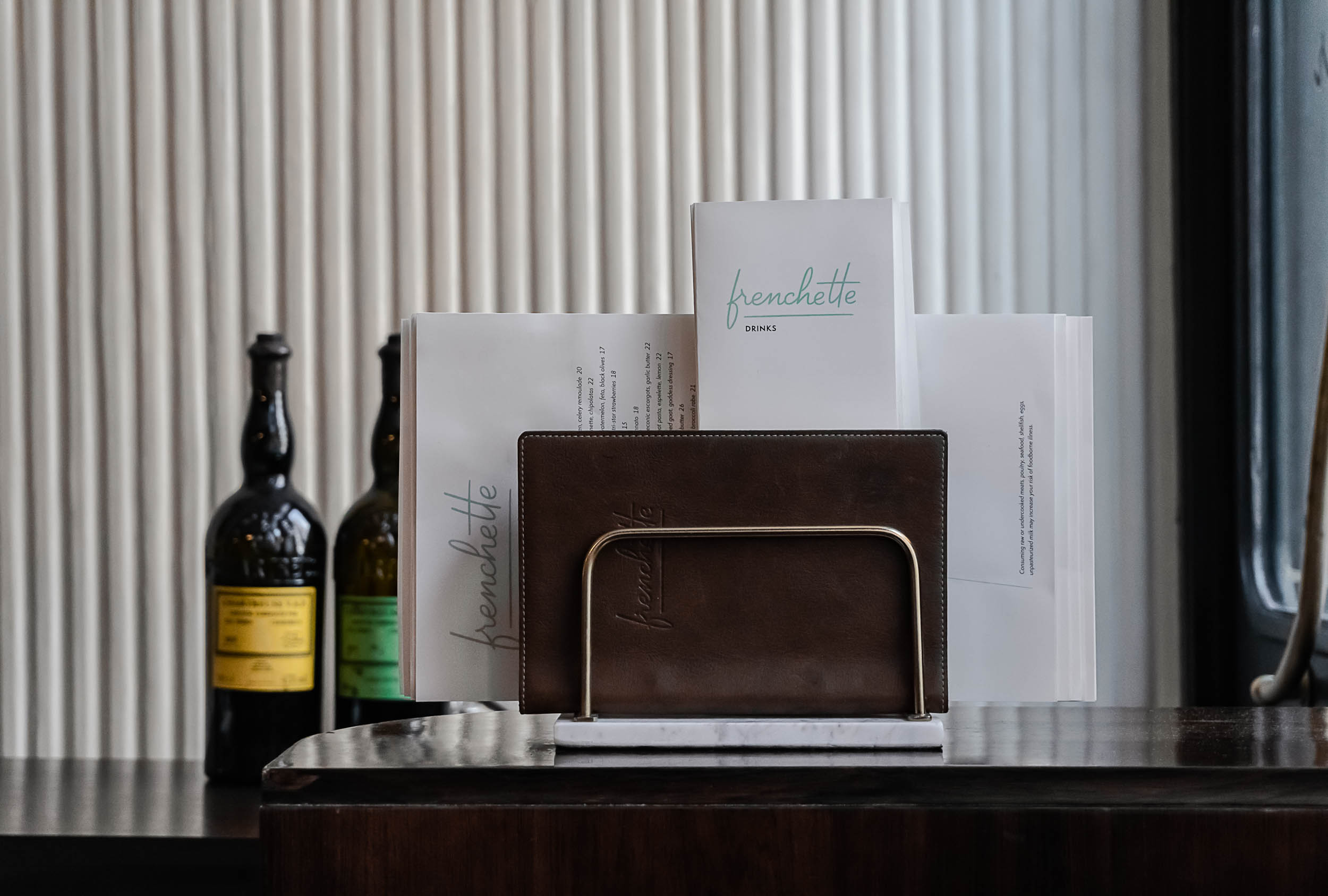
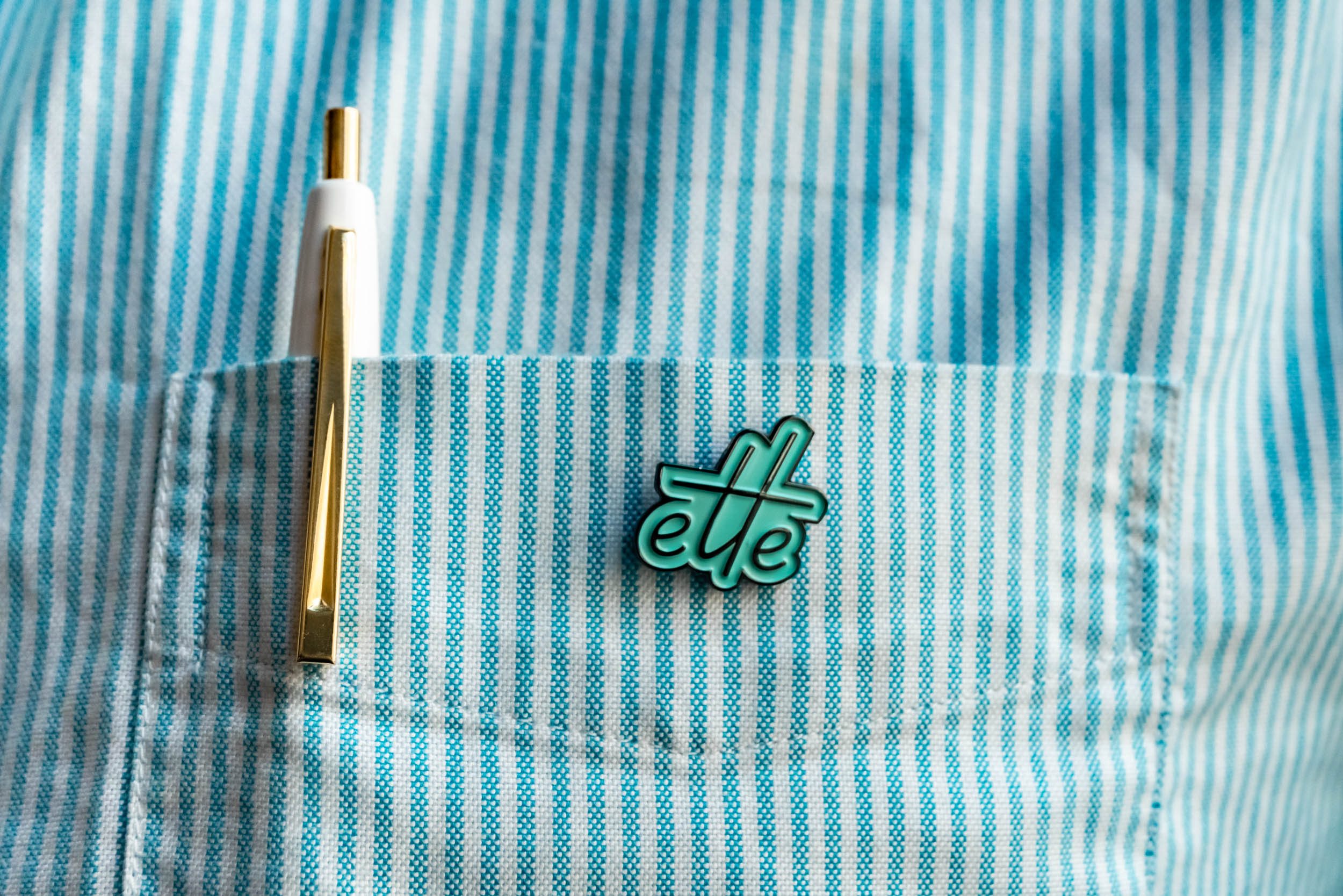
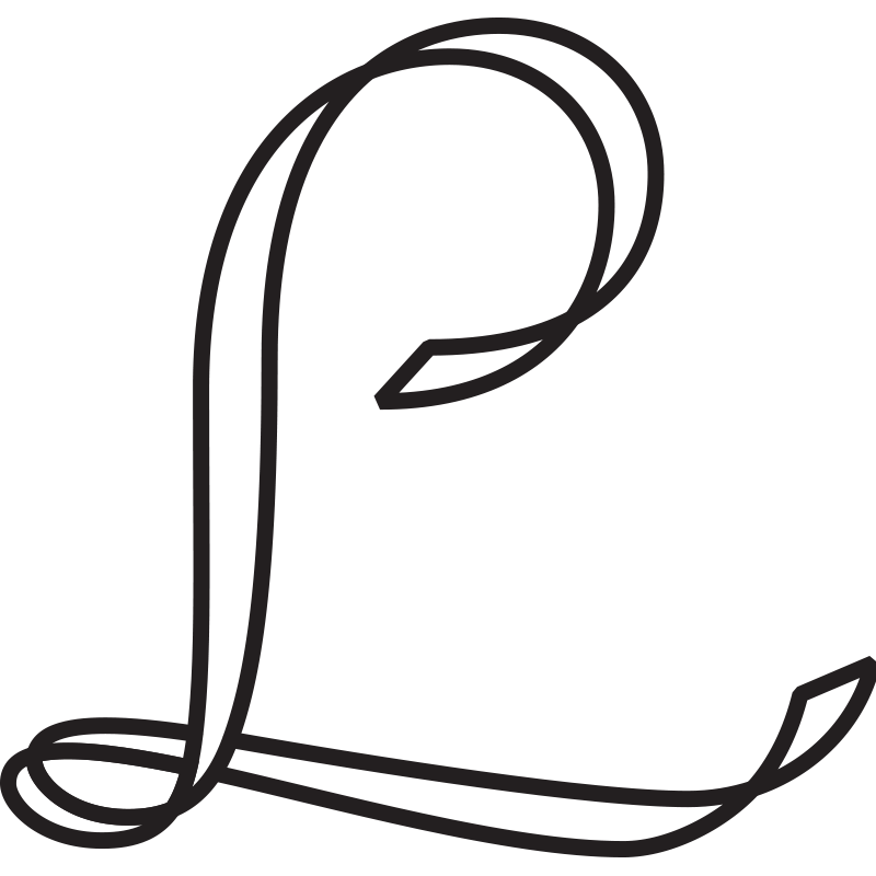
As I worked on the design and mood board, I started thinking of the restaurant as a cool French chick from the 60s or 70s living in modern-day New York, speaking with a heavy accent and smoking cigarettes, looking effortlessly chic in flat shoes and a leather jacket. I designed the custom-lettered logo on a fast, casual script that’s also quite controlled, and the typography on the menu follows the inclined angle of the logo.

This was designed under the creative direction of Matteo Bologna, and the project was then developed further by Sean O’Connor.
I’ve always wanted to do the branding for a restaurant, and seeing a logo I designed on a real restaurant (and in New York! I still can’t believe it!) is a fantastic feeling. The food there is absolutely fantastic too. I look forward to doing more projects like this in the future.

Typeface design
Bligh
A warm, playful sans-serif typeface that balances flavour and functionality.
2015
Typeface published by Dalton Maag (London, UK).
Designed with the support of the Dalton Maag team.
︎Selected as one of Typographica’s “Best Typefaces of 2015”.
︎Selected for the 11th Brazilian Graphic Design Biennial (Bienal ADG) in 2015.

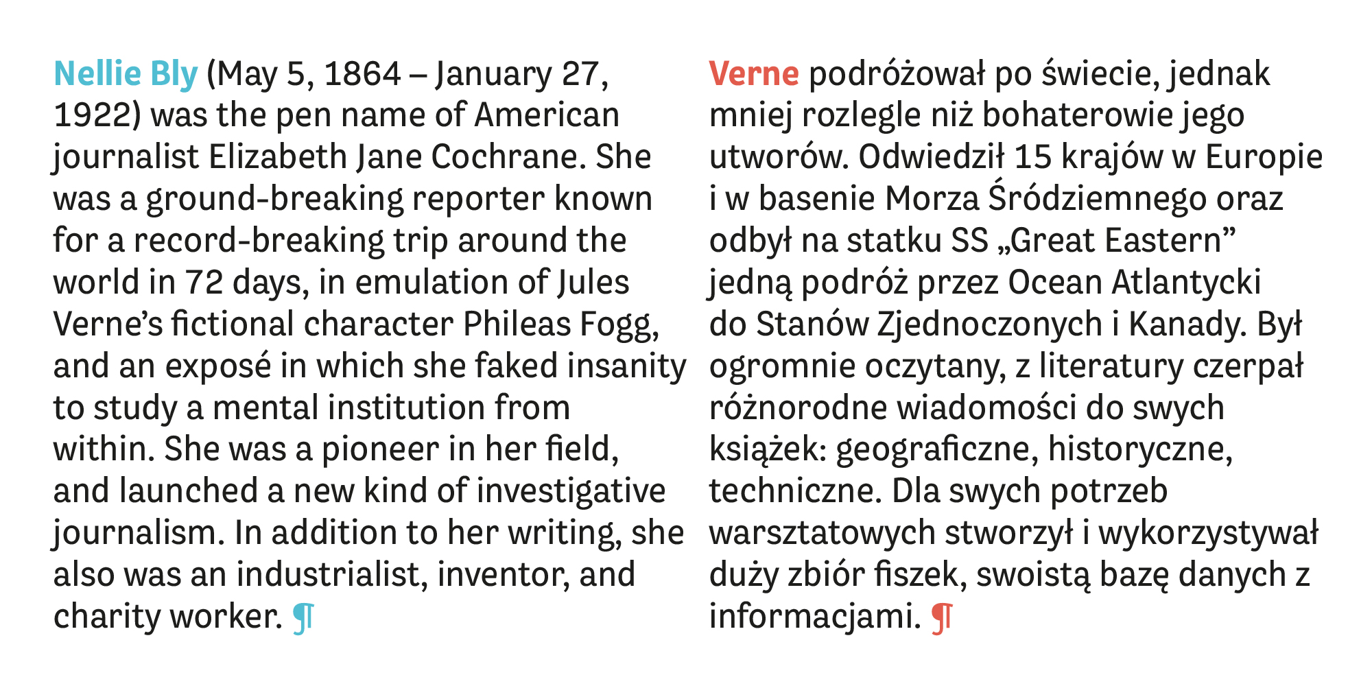
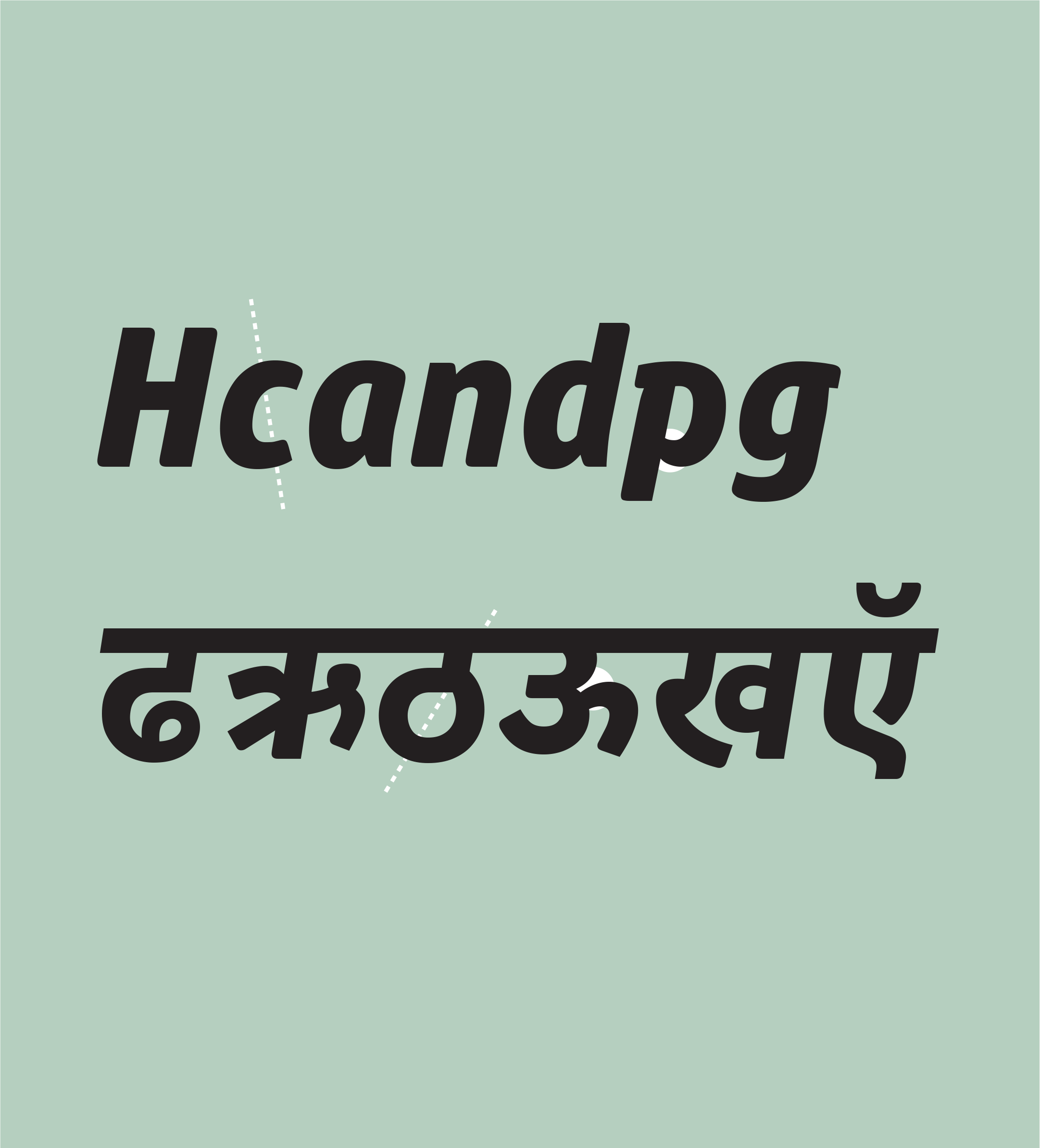
Bligh is a 3-weight sans-serif type family which I designed from scratch while working at Dalton Maag, published in April 2015.
The challenge was to design a low-contrast sans-serif that works well in text settings but has a warm, playful feel and a strong personality. It was an exercise in pushing its quirkiness and personality, and reeling it back to find the balance between flavour and functionality.

The characters often have a quirky skeleton, sometimes with an organic calligraphic influence, and with a slight nod to Victorian grotesque styles. It has very low contrast, and fairly condensed proportions, but is very readable in text sizes without losing its flavour.
The uppercase set has a more sober voice to increase the possibility of hierarchical variation when typesetting, since the family has no italics or small caps.
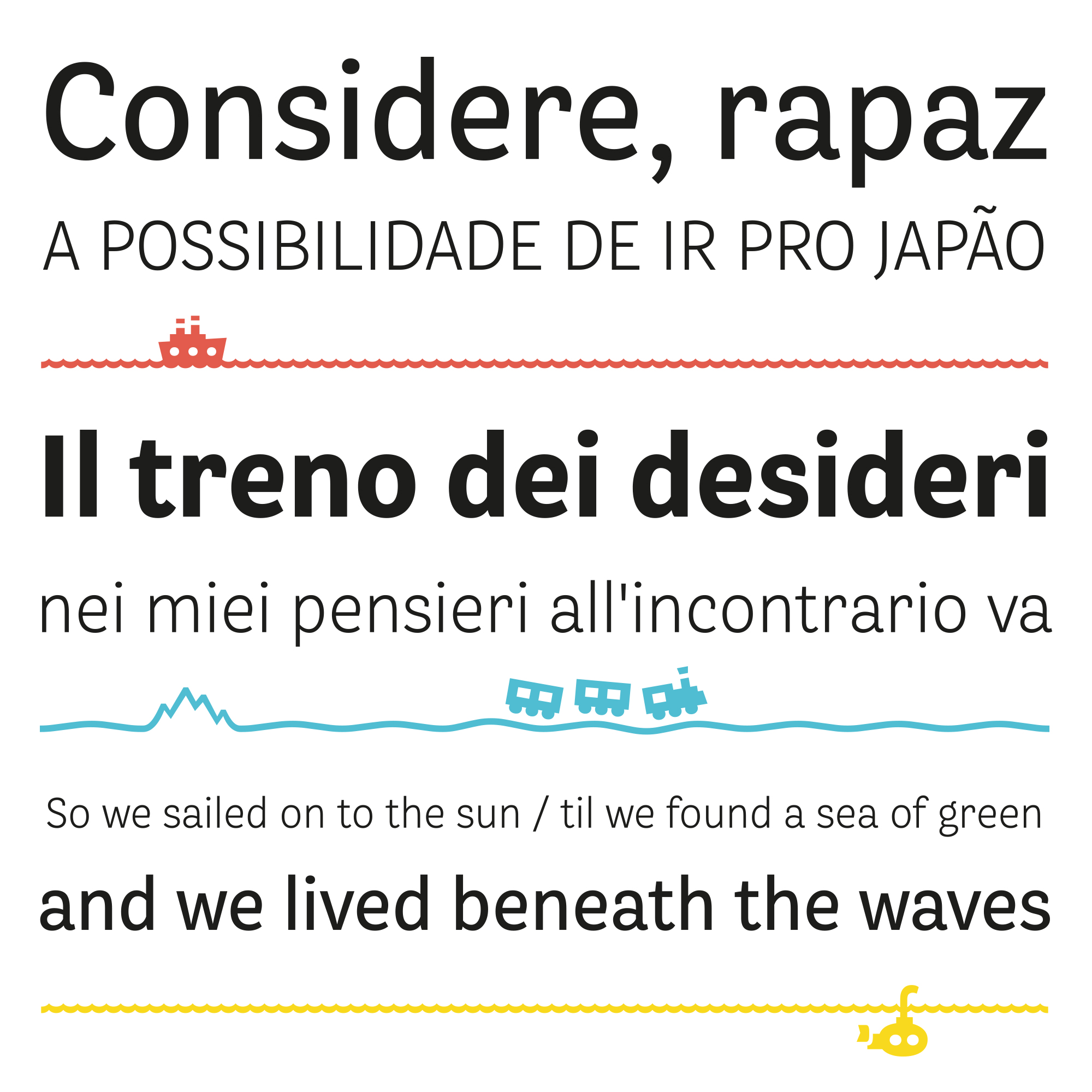
As a reference to the playful Victorian Grotesque influence, I also designed a set of symbols inspired by travel, which can be typeset in a continuous line to form a custom route of travel over hills, mountains and seas.
To purchase the font, please visit Dalton Maag's website (you can also get a free trial license there!).
Logo + icons
Artstring
Logo and icons for Artstring, an app that transforms museums into spaces of shared emotions.
2016–17
Logo and icons for the app “Artstring”.
Artstring is an app that transforms museums into spaces of shared emotions. It challenges the top-down authority of the museum as having the “one true interpretation” of artwork, and encourages visitors to form their own connections and string together a collection of pieces that evoke an emotional response.
I was asked to design the logo and monogram, the icons for the app, and the visual identity for the expansion of the app into real-world applications (in progress), and items that could be sold in museum shops.
The design of the logo and icons form the basis for the identity of the project. The icons are designed through a continuous line with a friendly feel. The monogram and flourish of the logo reference the baroque aesthetic of painting frames in traditional museums, rendered in an informal, naïve way to emphasize the approachability of museums and art through the app.
The app is currently under development and has been tested within the scope of the National Gallery in London.

Type design
Dalton Maag
Samples of projects designed during 3 years as a type designer at Dalton Maag.
2012–2015
Samples of work done as a font designer at Dalton Maag (London, UK).
All samples shown here were designed with the support of the Dalton Maag team.
I worked at the Dalton Maag type foundry for three years, designing custom typefaces, doing typographic refinement and working on typefaces for the Dalton Maag library, often as a project leader. The work spanned both Latin and non-Latin scripts, including Greek, Cyrillic, Thai and Devanagari.
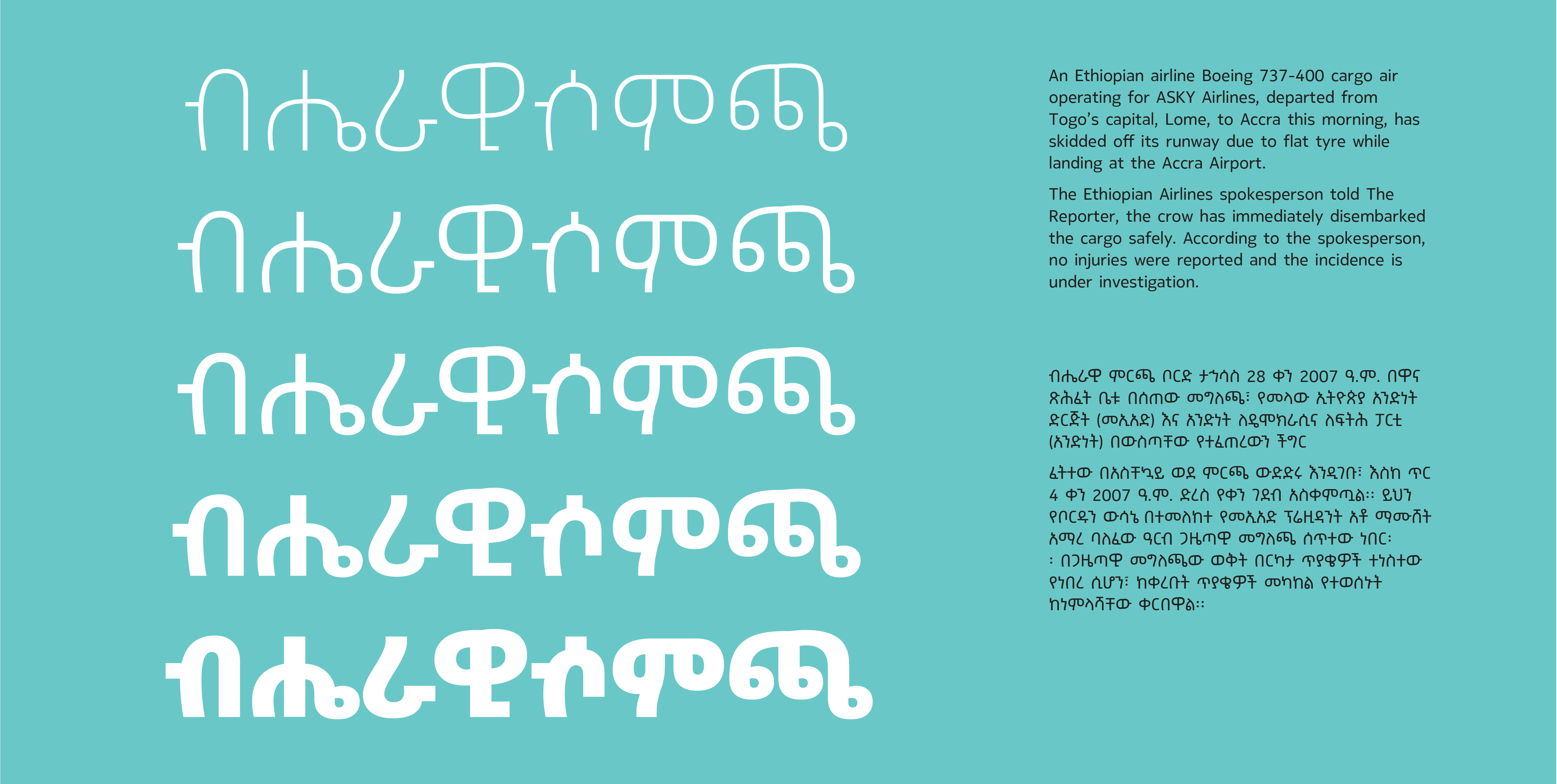
Nokia Ethiopic (with Riccardo de Franceschi and the Dalton Maag team)
One of my favorite projects was Nokia Headline Ethiopic. It is a headline version of the Nokia Pure typeface for the Ethiopic (or Amharic) script. It is a rare but challenging treat to work on the Ethiopic script. The script is by nature quite uneven, both in spacing, as there are cuts and protruding limbs which create gaps, and also in texture, as there are slight variations in inclination between characters, which makes the text appear dancing on the page. I did the full headline adaptation for five weights, with its character set of around 500 glyphs for each weight. The lead designer for the text version of the typeface was Riccardo de Franceschi.
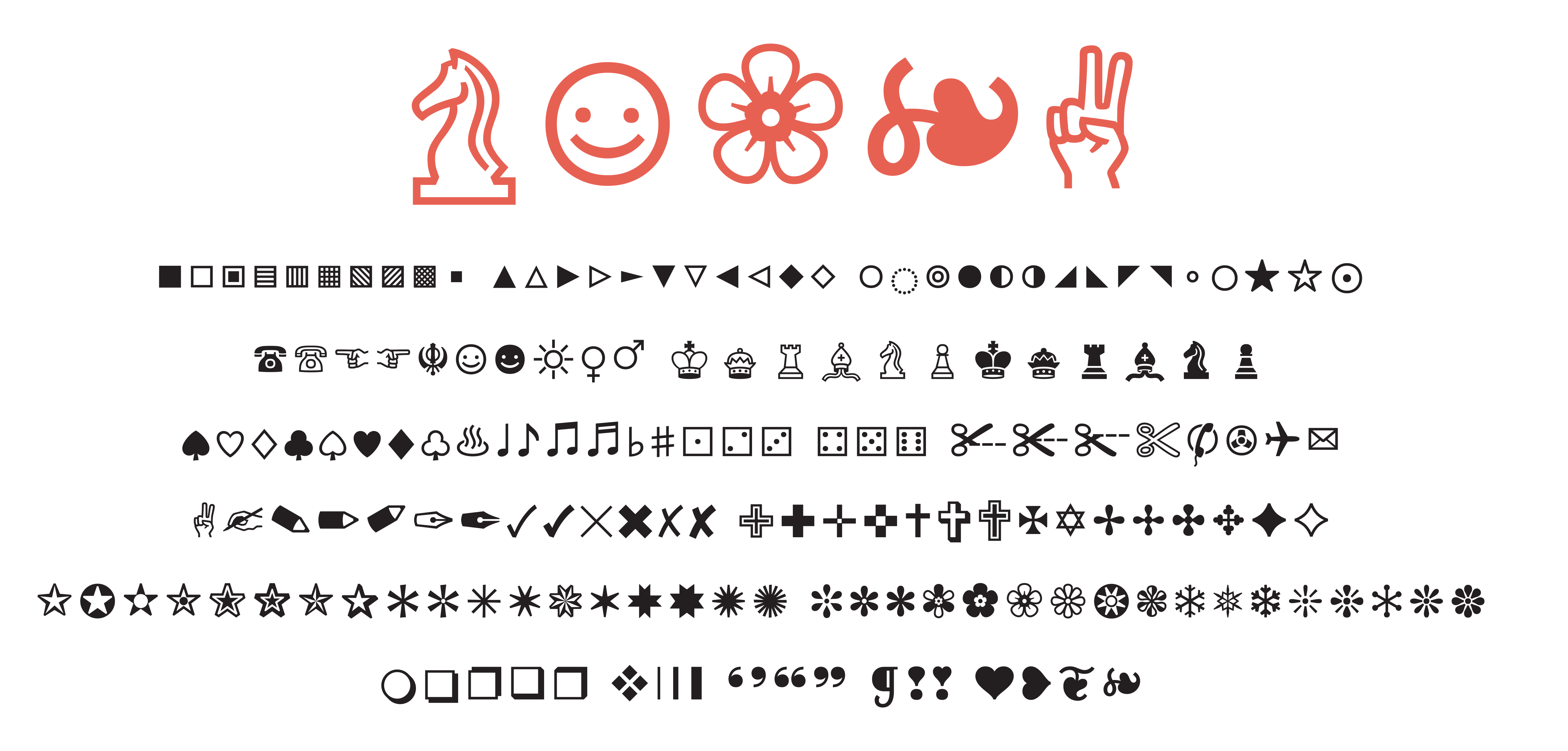
Icons — fallback font (with Eleni Beveratou and the Dalton Maag team)
Another personal favorite was work done for a fallback symbols font. It has been difficult to research: it is not easy to find reliable information on the subject, and the symbol set is very heterogeneous, combining groups of glyphs from many sources and with a variety of uses. Still, this has been a lot of fun to work on, and to apply typographic principles to what is essentially a set of small illustrations.
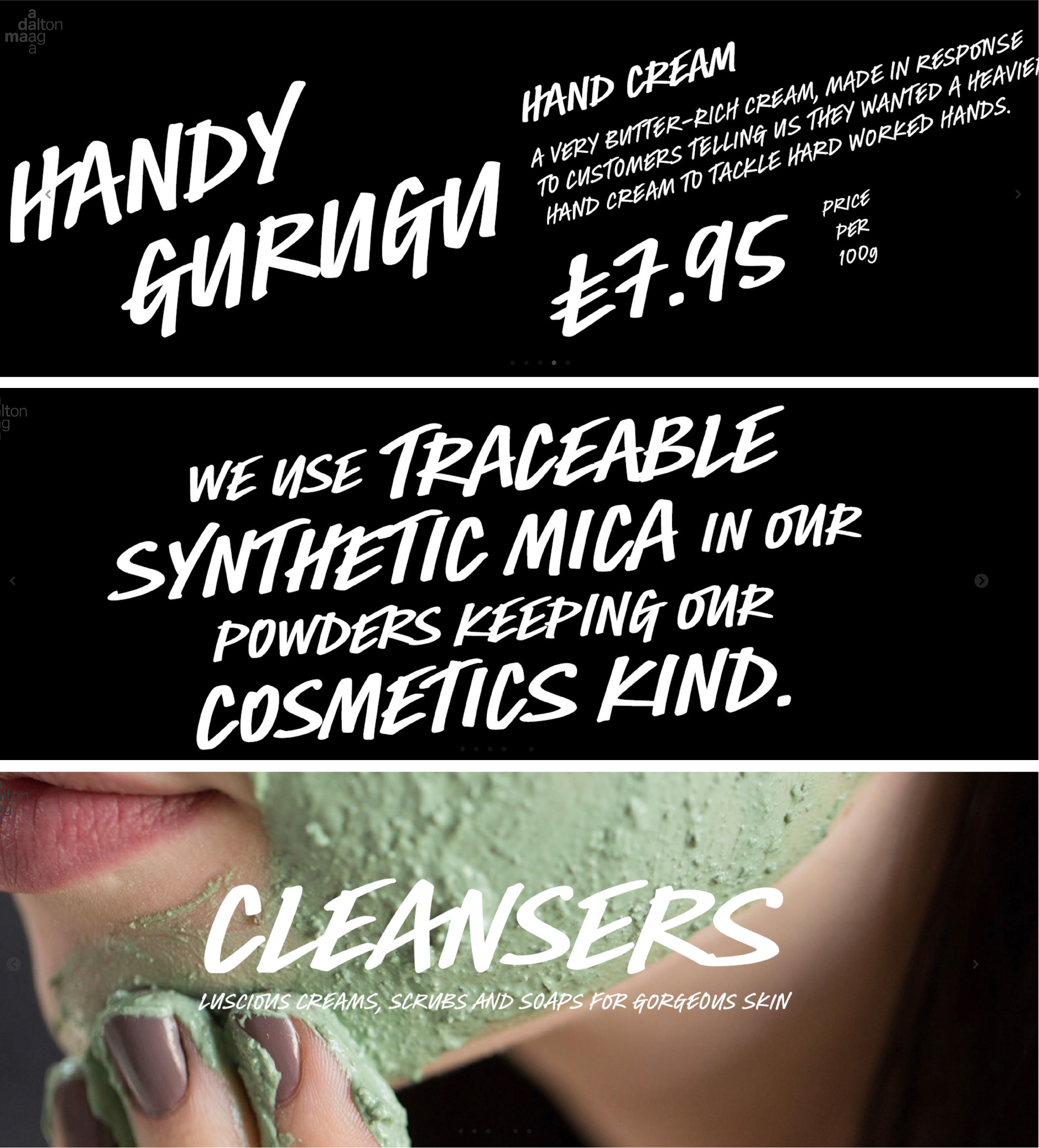
Finally, here is some work done for Hewlett Packard Devanagari (lead designer: Amélie Bonet), and the handwritten-style typeface designed for Lush Cosmetics (lead designer: Riccardo de Franceschi).
Lettering + Illustration
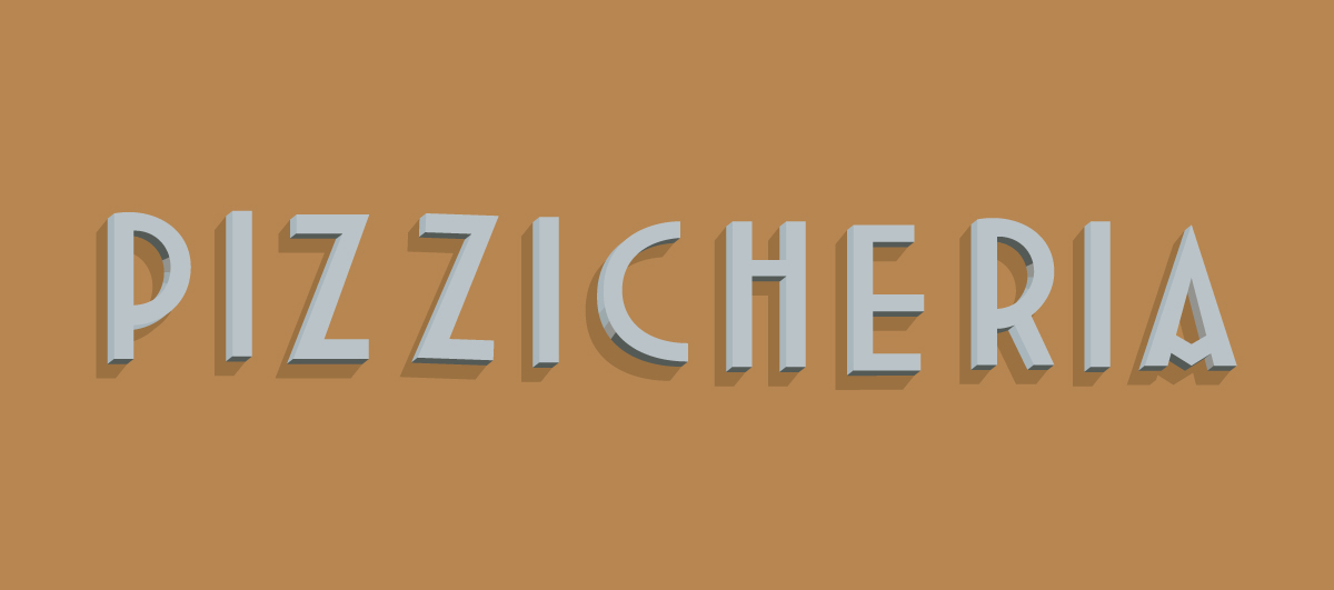
Urban Letterscape
A personal project of illustrations based on lettering seen on shopfronts and signage around different cities.
2014
Personal project: Illustrations of lettering seen on shop fronts
This is a personal project of illustrations based on lettering seen on shopfronts and signage in different cities. After moving from Brazil to Europe, I became fascinated with the different changing typographic landscape I found. I started taking pictures of shopfronts, walls and other such lettering, and keeping them in my hard drive, not quite sure what to do with it. This became a habit, even when going back home to visit (although it’s always more exciting when I’m traveling).
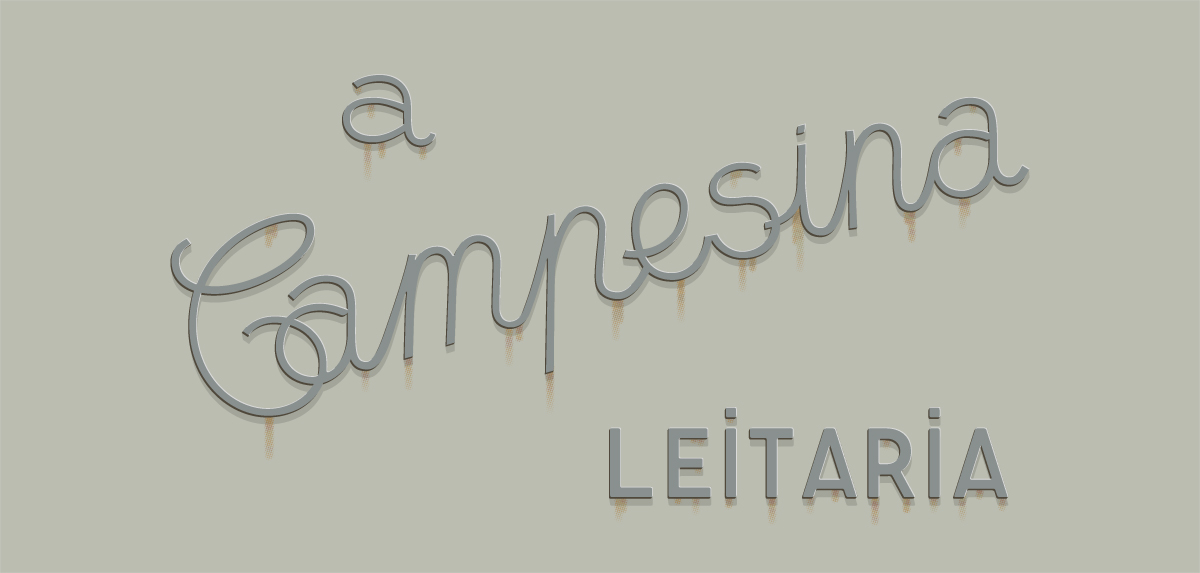
I started making illustrations out of some of these pictures. This has been a very enjoyable process. At the time I was working as a type designer, moving curves around lettershapes all day, but it was refreshing to notice how different it is to translate a 3-dimensional object into an illustration, and to draw shapes of letters that are not necessarily part of a bigger system (aside from perhaps an illustration style), not to mention using colour (I had almost forgotten what colour looked like!). I hope to continue with more of these when I get a chance.