
logo
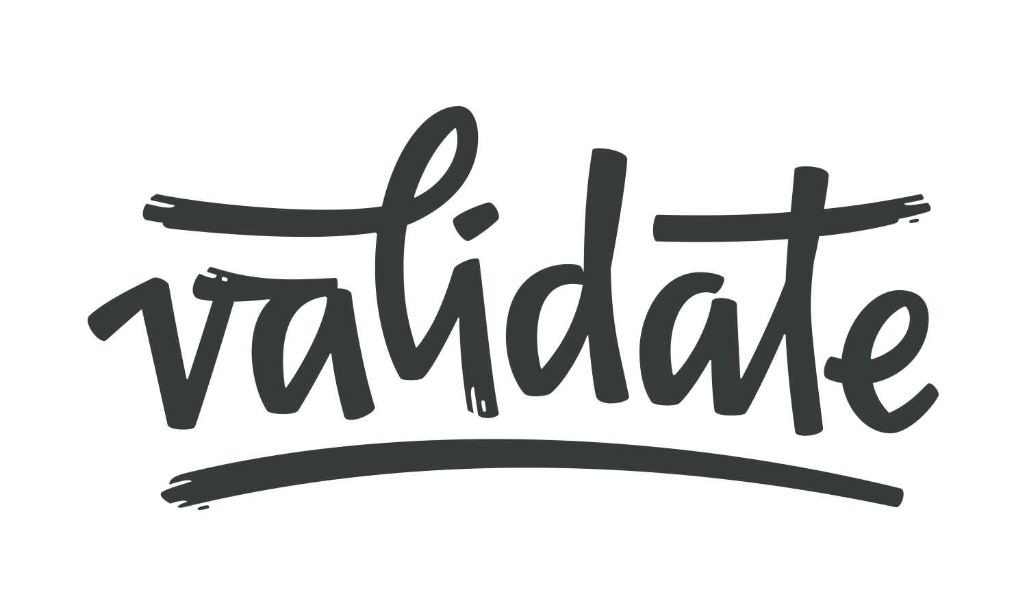
Validate
A hand-lettered logo with a brushy feel for a qualitative analytics company that wanted to move away from tech aesthetics.
2020
Logo and monogram design
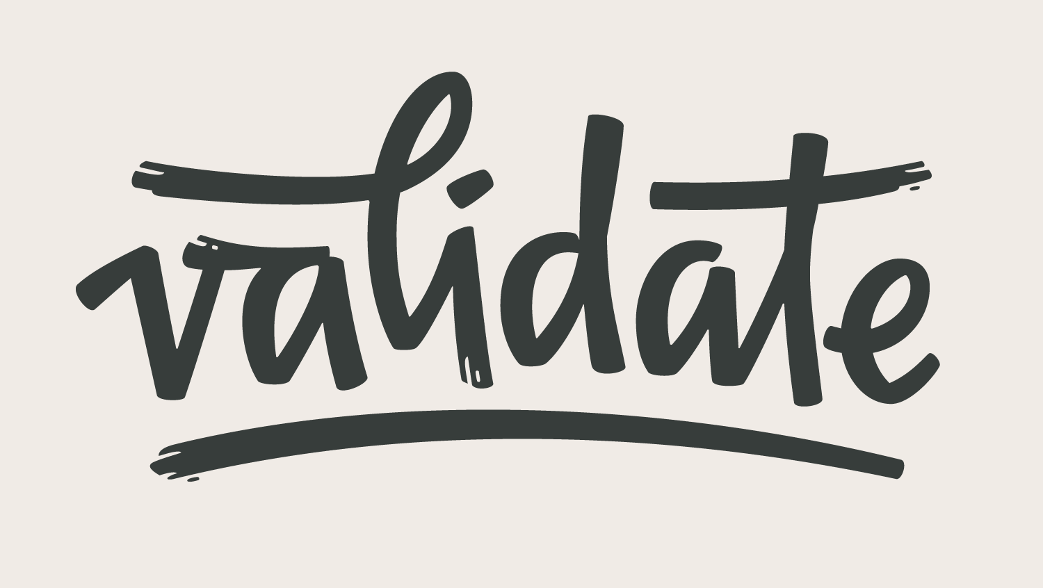
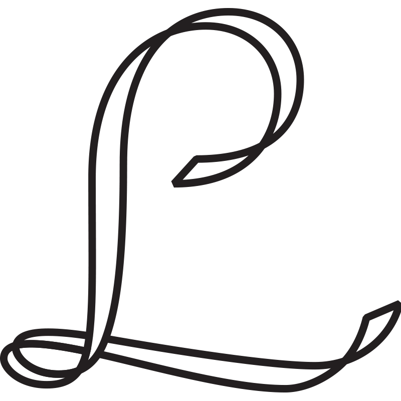
I was approached by Validate to create a hand-lettered logo and monogram. They offer qualitative analytics, and their clients are mostly UX designers testing their own products. To highlight the human aspect of their service, Validate wanted their logo to move away from the clean sans-serif wordmarks of the tech space, and were looking for something dynamic and brush-like, possibly cursive.
I worked on lots of hand sketches and had many conversations with the client trying to find the right “feel” of the lettering style. It should be casual, strong, distinctive. The client is also a designer (UX design), and he was open to this process and had a good sense of the feeling he wanted the logo to evoke. We ended up deciding on a fast, angular, semi-connected script.
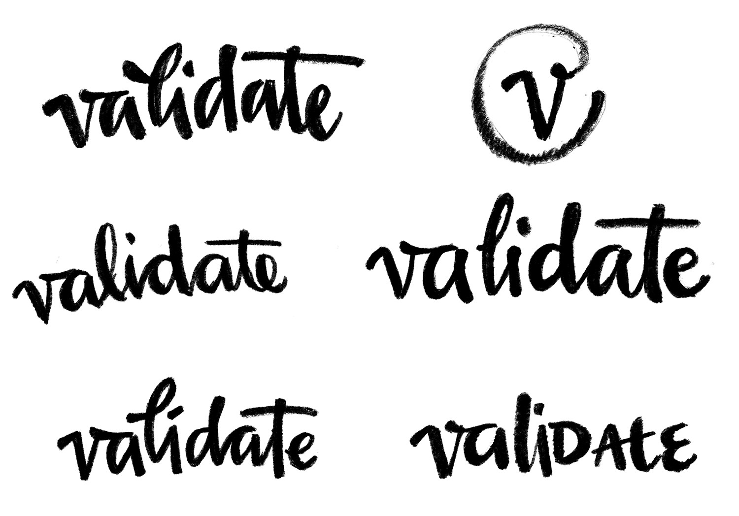
Early sketches
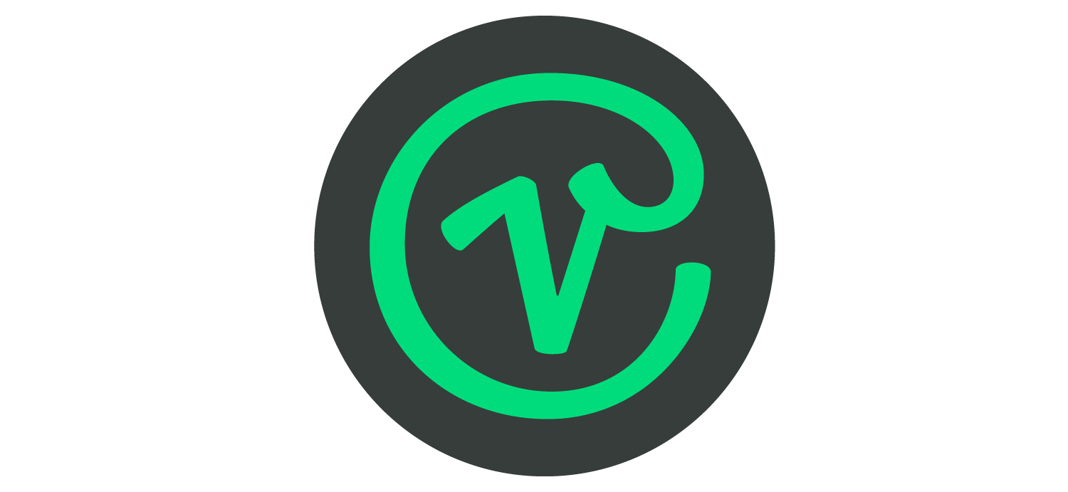
He also needed a monogram to be used as a profile picture on social media, as a favicon, etc, and wondered if we could hint at the tech world in the monogram design. For that, I took the initial v from the logo and transformed it into a kind of @ symbol.
Finally, they wanted the logo to work as a big illustrative feature on the website, but also to be functional in small sizes on screen (on a navigation bar, for example). We decided to take a type design approach to this and do a Display logo for large sizes, a Regular one for medium sizes, and an optically-adjusted small logo that is still legible when small. The same was done for the monogram, which had to work as a profile pic and also as a tiny favicon.
Comparison between the logo for large sizes and small sizes